Drawing Violin Plots with Seaborn
Introduction
A violin plot is used to display the distribution and probability density of multiple data groups. Similar to a box plot, it offers a better representation of data density. Violin plots are particularly useful when dealing with very large datasets that are difficult to display individually. Python’s Seaborn package makes it very convenient to create violin plots.
Parameters
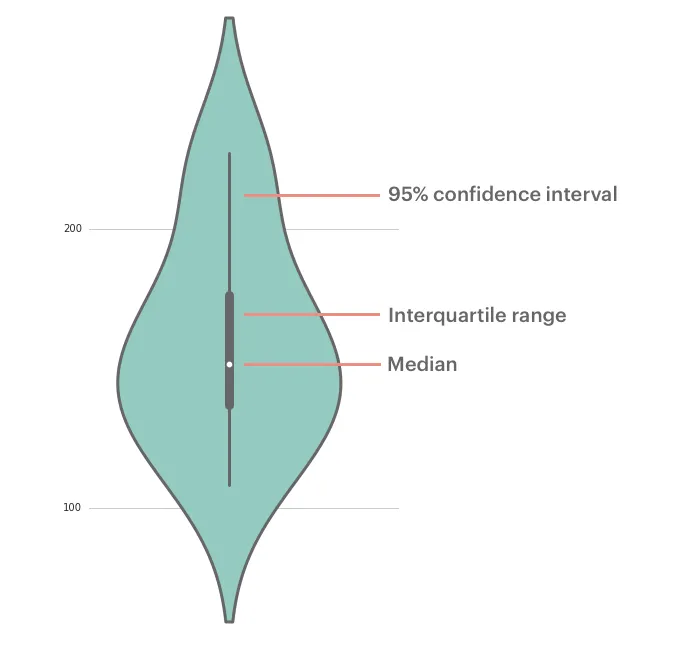
The parameters corresponding to each position in a violin plot are shown above. The middle line represents the box plot data, specifically the 25th, 50th (median), and 75th percentiles. The thin lines indicate the 95% confidence interval.
Drawing Violin Plots with Seaborn
Single Variable Data
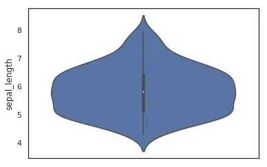
While a box plot would suffice for a single variable, a violin plot can certainly be used as well:
    import seaborn as sns
    sns.set(color_codes=True)
    sns.set_style("white")
    df = sns.load_dataset('iris')
    sns.violinplot( y=df["sepal_length"] )
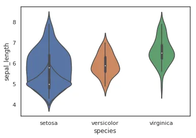
Single Variable with Multiple Groups
When data contains multiple groups, you can compare them using grouping:
    import seaborn as sns
    sns.set(color_codes=True)
    sns.set_style("white")
    df = sns.load_dataset('iris')
    sns.violinplot( x=df["species"], y=df["sepal_length"] )
    #sns.plt.show()
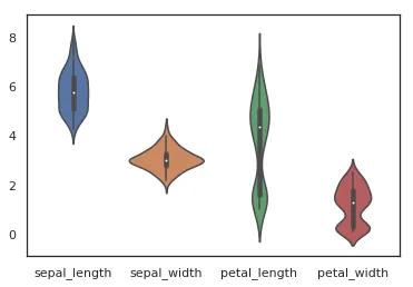
Multiple Variable Comparison
Violin plots are also very convenient for comparing multiple variables. Here, we’ll compare the first four variables.
    import seaborn as sns
    sns.set(color_codes=True)
    sns.set_style("white")
    df = sns.load_dataset('iris')
    sns.violinplot(data=df.iloc[:,0:4])
    #sns.plt.show()
Conclusion
This concludes the introduction to drawing violin plots using the Seaborn package in Python. For more detailed documentation, please refer to https://seaborn.pydata.org/generated/seaborn.violinplot.html
- 原文作者:春江暮客
- 原文链接:https://www.bobobk.com/en/206.html
- 版权声明:本作品采用知识共享署名-非商业性使用-禁止演绎 4.0 国际许可协议进行许可,非商业转载请注明出处(作者,原文链接),商业转载请联系作者获得授权。