Python Data Visualization - The Post-2000 Gaokao Generation
The post-2000 generation has finished their Gaokao (National College Entrance Examination), and there’s been extensive media coverage (they are the “fresh meat” generation, after all!). Many reports focused on this year’s examinee data, presenting it with stunning charts. Feeling a bit jealous about how beautiful those charts are? Do you want to try making one yourself? These charts are actually products of data visualization created with Python, so yes, you can definitely make them yourself!
Preparation
-
Libraries
chartspyecharts
-
Data
- Collected directly from Baidu.
Common Chart Types
Bar charts and line charts are frequently seen and used, so let’s start with the basics.
1. Bar Chart
# Number of Gaokao examinees
gaokao_num = [940,940,...,375]
gaokao_num.reverse()
# Number of admitted students
luqu_num = [700,705,...,221]
luqu_num.reverse()
# Admission rate
luqu_lev= [74.46,75,...,59]
luqu_lev.reverse()

import charts

options = {
    'chart'   : {'zoomType':'xy'},
    # Title
    'title'   : {'text': '2000-2017 Gaokao Data'},
    # Subtitle
    'subtitle': {'text': 'Source: edu.sina.com.cn'},
    # X-axis
    'xAxis'   : {'categories': ['2000',...,'2017']},
    # Y-axis
    'yAxis'   : {'title': {'text': 'Million people/year'}},
    }
series =  [{
    'type': 'column',
    'name': 'Number of Gaokao Examinees',
    'data': gaokao_num
},{
    'type': 'column',
    'name': 'Number of Admitted Students',
    'data': luqu_num
}
]
charts.plot(series, options=options, show='inline')
Due to a minor issue with my pyecharts setup, I used the charts library. Using pyecharts is even simpler, but I won’t repeat it here. You can check the source code if needed.
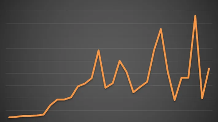
(Number of Gaokao examinees vs. Number of admitted students)
This year, there are 9.75 million examinees (not visible in the table as I didn’t include it), but you can see that the number of Gaokao examinees remained stable between 2010 and 2018. This is unavoidable given the large population base. The phrase “thousands of soldiers and horses crossing a single-plank bridge” certainly feels apt…
2. Line Chart
If the bar chart above works, then the line chart is very simple; just change the type from column to line.
series =  [{
    'type': 'line',
    'name': 'Admission Rate',
    'data': luqu_lev,
    'marker':{
        'lineWidth':2,
        'lineColor':'#90ed7d'
    }
}
]
Originally, I intended to display both the bar chart and the line chart on a single graph, but the Y-axis values were too large, making the changes in admission rate look insignificant. Therefore, I separated them.
Map Charts
Here’s a Gaokao difficulty ranking. I, too, came from the “hard mode” back in the day. I really feel for the students in Jiangsu; it seems like Ge Jun is designing the math questions again, so Jiangsu will likely be trending again.
Now, let’s use pyecharts to create a map chart and see which province in China has the most Gaokao examinees.
from pyecharts import Map
# Process data
add =["Beijing",...,"Tibet"]
num = [6.3,...,2.53]
dict_data = dict(zip(add,num))
data = [tuple(i) for i in zip(add,num)]
data_pro = data
geo = Map("Distribution of Gaokao Examinees by Province",
          "data from : gaokao.eol.cn",
          title_color="#fff",
          title_pos="center",
          width=1000,
          height=600,
          background_color='#404a59'
          )
attr, value = geo.cast(data_pro)
geo.add("",  attr, value,
          visual_range=[0, 80],
          maptype='china',
          visual_text_color="#fff",
          symbol_size=10,
          is_visualmap=True)
geo.render("各省高考分布.html") # Generates an HTML file
geo # Displays directly in the notebook
Effect Diagram: It seems that students in Henan and Guangdong are under a lot of pressure (!_!)
A Little More
I strongly recommend using pyecharts; it’s simple and easy to use. However, for me, only map-related charts work with pyecharts; other types don’t seem to render, so I was forced to use the charts library.
Finally, I hope all Gaokao examinees achieve their desired results so they can celebrate to their heart’s content!
- 原文作者:春江暮客
- 原文链接:https://www.bobobk.com/en/320.html
- 版权声明:本作品采用知识共享署名-非商业性使用-禁止演绎 4.0 国际许可协议进行许可,非商业转载请注明出处(作者,原文链接),商业转载请联系作者获得授权。