Using folium to Draw a COVID-19 Pandemic Map
After being contained in China, the COVID-19 pandemic became increasingly severe worldwide. Countries and regions publish daily new infection and death data to help fight the pandemic globally. To visualize pandemic data and help people understand the latest situation worldwide, the author decided to create a global COVID-19 map using the versatile Python tool.
First, Python has many plotting packages such as matplotlib, pandas, plotly, etc. They are great for data analysis but somewhat lacking for drawing maps. Therefore, this article uses the widely adopted mapping tool folium and saves the results as HTML. Drawing the pandemic map mainly includes the following steps:
- Getting global COVID-19 data
- Drawing a world map
- Data preprocessing
- Adding pandemic data to the map
- Improving the pandemic map
Getting Global COVID-19 Data
To get the latest data, Alipay publishes daily data, but I couldn’t find a public API. Through search engines, I found the following resources updated daily:
- WHO Public Data
- Worldometers Data
- API JSON data from thevirustracker
WHO data is of course the newest and most reliable. On the WHO data website, you can click through to access it. Using Chrome’s Inspect tool to check network connections, the data API endpoint was found at WHO API
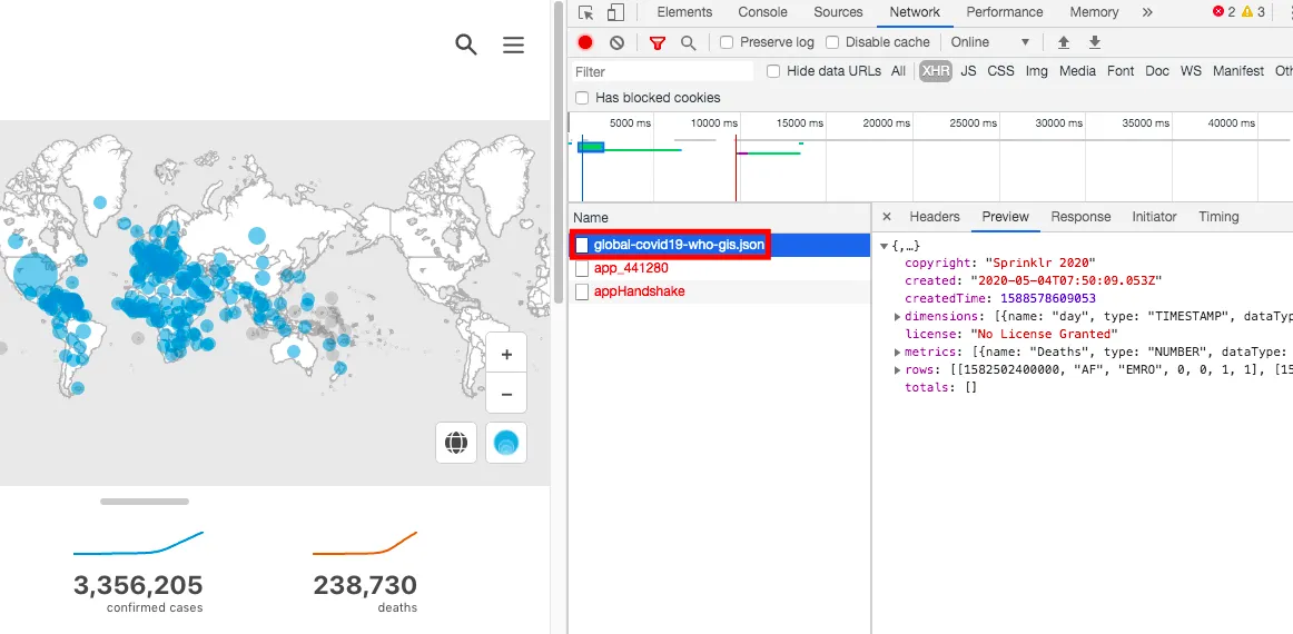
This is JSON data and can be parsed with Python’s json package. Since this is the most authoritative source, this article uses WHO data.
First, install the necessary packages for this article:
pip install folium
pip install numpy
pip install pandas
Next is the real data fetching and processing flow.
## Download data
import requests
import json
covid19_json = requests.get("https://dashboards-dev.sprinklr.com/data/9043/global-covid19-who-gis.json").content

## Parse JSON data
covid19_json = json.loads(covid19_json)

## Check data column names
print(covid19_json['dimensions'])
"""
[{'name': 'day', 'type': 'TIMESTAMP', 'dataType': None},
 {'name': 'Country', 'type': 'STRING', 'dataType': None},
 {'name': 'Region', 'type': 'STRING', 'dataType': None}]
"""

### The first three rows are timestamp, country, region
print(covid19_json['metrics'])
"""
[{'name': 'Deaths', 'type': 'NUMBER', 'dataType': None},
 {'name': 'Cumulative Deaths', 'type': 'NUMBER', 'dataType': None},
 {'name': 'Confirmed', 'type': 'NUMBER', 'dataType': None},
 {'name': 'Cumulative Confirmed', 'type': 'NUMBER', 'dataType': None}]
"""
## The last four rows are daily deaths, cumulative deaths, daily confirmed cases, cumulative confirmed cases
Based on each row’s data, finally create a dataframe for analysis:
import pandas as pd

## Define column names
colname = pd.DataFrame(covid19_json['dimensions'])["name"].append(pd.DataFrame(covid19_json['metrics'])["name"]).to_list()

## Generate dataframe
covid19_dataframe = pd.DataFrame(covid19_json["rows"], columns=colname)

covid19_dataframe.head()
"""
day    Country  Region  Deaths  Cumulative Deaths  Confirmed  Cumulative Confirmed
0 1582502400000 AF      EMRO    0       0              1          1
1 1582588800000 AF      EMRO    0       0              0          1
2 1582675200000 AF      EMRO    0       0              0          1
3 1582761600000 AF      EMRO    0       0              0          1
4 1582848000000 AF      EMRO    0       0              0          1
"""
Up to here, we have obtained data from WHO’s COVID-19 official site and generated a Python DataFrame including time, country, region, deaths, cumulative deaths, confirmed cases, and cumulative confirmed cases.
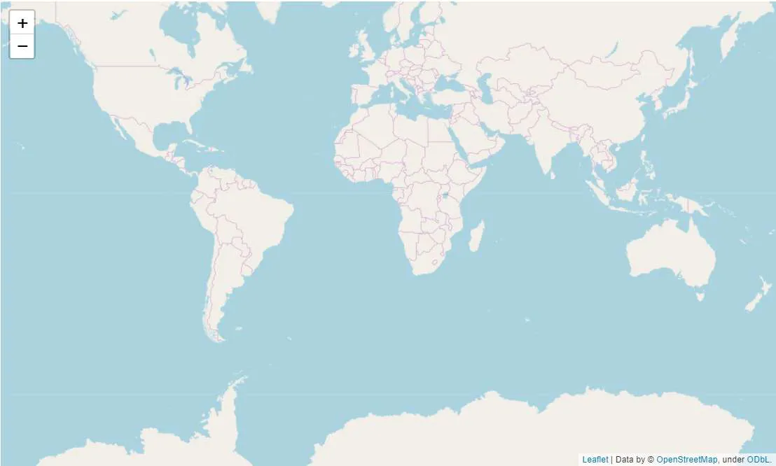
Drawing the World Map
Next, draw a blank world map to add confirmed cases and death data later. We use the previously mentioned folium package. For details, see the folium official docs.
Drawing a world map:
import folium

m = folium.Map()
m
You will see a generated map:
Data Preprocessing
Since WHO uses country codes in short form, to be compatible with folium, we need a dictionary to map WHO’s country codes to folium’s country codes and get geo-boundary info. This allows us to represent countries by colors and filter unnecessary info.
Folium provides related country geo JSON data:
## Download geojson data
url = "https://raw.githubusercontent.com/python-visualization/folium/master/examples/data/world-countries.json"

# If GitHub cannot be accessed, use https://www.bobobk.com/wp-content/uploads/2020/05/world-countries.json as a substitute

geojson = json.loads(requests.get(url).content)
The country code CSV file has been downloaded and is available for download here:
Replace the country codes in COVID-19 data:
## Map country codes
df_abb = pd.read_csv("https://www.bobobk.com/wp-content/uploads/2020/05/country_codes.csv", header=None)
dic_abb = {df_abb.iloc[i,1]: df_abb.iloc[i,2] for i in range(np.shape(df_abb)[0])}

covid19_dataframe['fullname'] = covid19_dataframe['Country'].map(dic_abb)

## Simplify data to only include the latest date confirmed and cumulative confirmed cases
today = str(covid19_dataframe.day.unique().max())
covid19_dataframe = covid19_dataframe[covid19_dataframe.day == today]

covid19_dataframe = covid19_dataframe[["Country", "fullname", "Cumulative Confirmed", "Confirmed"]]
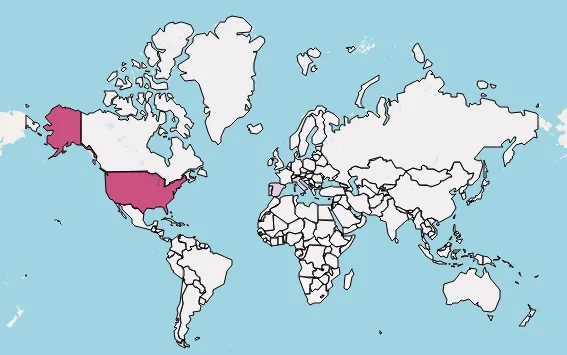
Adding Pandemic Data to the Map
Now, witness the magic: draw the latest COVID-19 data from WHO onto the map with folium.Choropleth:
folium.Choropleth(
    geo_data=url,
    name="covid-19 cumulative confirm map",
    data=covid19_dataframe,
    columns=["fullname", "Cumulative Confirmed"],
    key_on="feature.id",
    fill_color='PuRd',
    nan_fill_color='white'
).add_to(m)
Cumulative confirmed cases map:
Parameter explanation:
- geo_data: URL to geojson data (no need to download)
- name: Map layer name
- data: Pandas DataFrame with the data
- columns: Two columns — one for country code, must match geo_data, and one numeric column (here cumulative confirmed cases)
- key_on: Specifies the geojson feature property to match with DataFrame keys (here country full name)
- fill_color: Color scheme
- nan_fill_color: Fill color for missing data
Let’s also add daily new confirmed cases map:
m = folium.Map()
folium.Choropleth(
    geo_data=url,
    name="covid-19 confirm map",
    data=covid19_dataframe,
    columns=["fullname", "Confirmed"],
    key_on="feature.id",
    fill_color='PuRd',
    nan_fill_color='white'
).add_to(m)
# m.save("new_confirm.html")
New confirmed cases map:
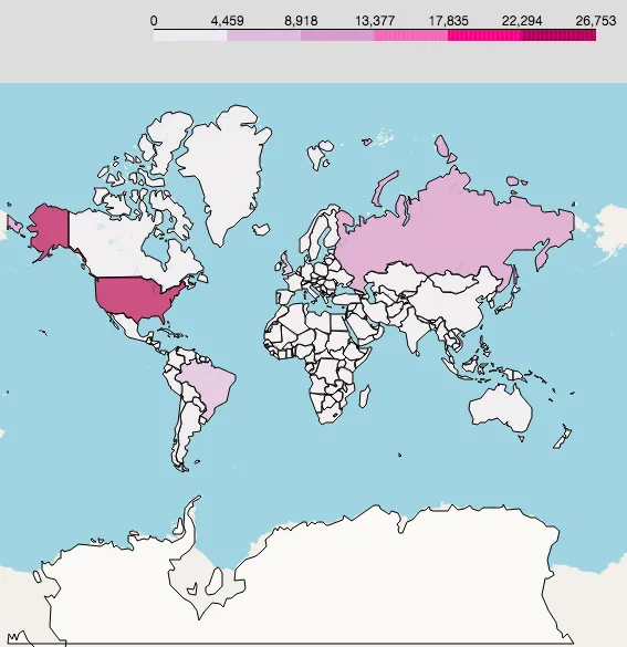
Improving the Pandemic Map
The previous maps show confirmed cases, but due to large differences in numbers, most countries appear white (zero or near zero cases). So, we apply a logarithmic transformation to better visualize differences.
Code to draw improved maps:
covid19_dataframe["log_total_confirm"] = np.log(covid19_dataframe["Cumulative Confirmed"] + 1)
covid19_dataframe["log_new_confirm"] = np.log(covid19_dataframe["Confirmed"] + 1)

covid19_dataframe.head()

## Log-transformed cumulative confirmed cases
m = folium.Map()
folium.Choropleth(
    geo_data=url,
    name="covid-19 log total confirm map",
    data=covid19_dataframe,
    columns=["fullname", "log_total_confirm"],
    key_on="feature.id",
    fill_color='PuRd',
    nan_fill_color='white'
).add_to(m)
m.save("total_confirm_improve.html")

## Log-transformed new confirmed cases
m = folium.Map()
folium.Choropleth(
    geo_data=url,
    name="covid-19 log new confirm map",
    data=covid19_dataframe,
    columns=["fullname", "log_new_confirm"],
    key_on="feature.id",
    fill_color='PuRd',
    nan_fill_color='white'
).add_to(m)
m.save("new_confirm_improve.html")
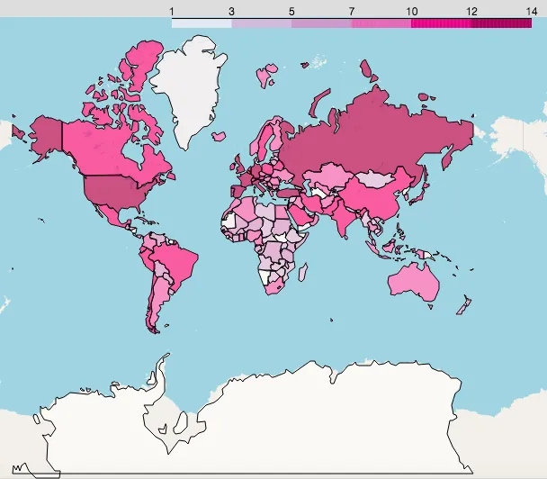
Result visualization:
Log cumulative confirmed:
Log new confirmed:
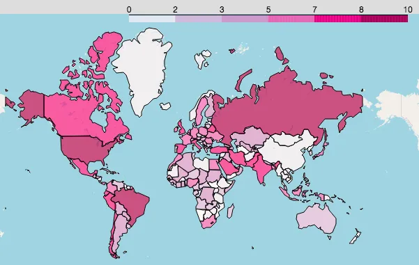
You can clearly see where new cases are rising fast and which areas are safer. Pay special attention to these countries and regions.
Summary
This article combines WHO’s global COVID-19 data with the folium package to draw maps of total confirmed and new confirmed cases worldwide. It helps people worldwide get the latest updates daily, take care of their health, go out less, wash hands frequently, and wear masks — contributing to the fight against COVID-19.
Full code download link
Python COVID-19 analysis code download
Notes
For daily updated info, the site offers daily pandemic data views at tool.bobobk.com with API addresses:
- 原文作者:春江暮客
- 原文链接:https://www.bobobk.com/en/624.html
- 版权声明:本作品采用知识共享署名-非商业性使用-禁止演绎 4.0 国际许可协议进行许可,非商业转载请注明出处(作者,原文链接),商业转载请联系作者获得授权。