Lollipop charts, as a variant of bar charts and dot plots, are becoming increasingly popular in scientific research due to their simplicity and clarity. This type of chart cleverly combines the advantages of bar charts and scatter plots, providing a visually more appealing way to represent data.
Introduction to Lollipop Charts
In a lollipop chart, each data point is represented by a “lollipop,” consisting of a line (the stick) and a dot (the candy) at the end of the line. The length of the line represents the magnitude of the value, while the dot highlights the specific data point. This format is especially suitable for comparing a limited number of categories or time points, making it an excellent choice for data visualization in fields such as biology, medicine, and environmental science.
The main advantage of lollipop charts lies in their ability to clearly convey information without confusing the audience. By focusing attention on individual data points, lollipop charts reduce visual clutter, making it easier for viewers to distinguish differences between categories. This is particularly useful when presenting complex datasets to a broad audience including researchers, practitioners, and policymakers.
Additionally, lollipop charts can be customized with color coding, annotations, and other graphical elements to enhance interpretability. For example, different colors can represent various experimental conditions, and annotations can provide context for specific data points. These features make lollipop charts a versatile tool for highlighting key findings and trends.
Python Code for Plotting
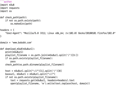
Let’s assume we have the following data set with cell types: ‘ILC2’, ‘B cell’, ‘Neutrophil’, ‘Macrophage’, ‘NK NKT’, ‘T cell’, ‘Dendritic cell’, ‘Mast cell’, ‘Monocyte’. The plot overlays line segments and scatter points. Here is the code:
import matplotlib.pyplot as plt

# Set data
cell_types = ['ILC2', 'B cell', 'Neutrophil', 'Macrophage', 'NK NKT', 'T cell', 'Dendritic cell', 'Mast cell', 'Monocyte']
shared_tissues = [7, 6, 4, 4, 3, 2, 1, 1, 0]
colors = ['red', 'lightblue', 'yellow', 'orange', 'blue', 'green', 'brown', 'pink', 'grey']

# Start plotting
fig, ax = plt.subplots()

# Draw horizontal lines
for i, (ct, st) in enumerate(zip(cell_types, shared_tissues)):
    ax.hlines(y=ct, xmin=0, xmax=st, color=colors[i], linewidth=2, label=ct)

# Scatter points
scatter = ax.scatter(shared_tissues, cell_types, s=100, c=colors, edgecolors='black')

# Add values
for i, txt in enumerate(shared_tissues):
    ax.annotate(txt, (shared_tissues[i], cell_types[i]), xytext=(5, -5), textcoords='offset points')

ax.set_xlabel('Cells ')
ax.set_ylabel('')
ax.grid(True, which='both', color='gray', linestyle='--', linewidth=0.5)
ax.legend(loc='center left', bbox_to_anchor=(1, 0.5))

plt.tight_layout(rect=[0, 0, 0.85, 1])
plt.savefig('lolipython.webp', bbox_inches='tight')
Result:
Summary
Overall, the lollipop chart is a powerful and flexible visualization technique that effectively conveys scientific data, promotes better understanding, and supports informed decision-making in research and other fields.
In this article, we used the matplotlib library to generate a lollipop chart by overlaying lines and scatter points, achieving a visually pleasing scientific figure. Also, the new version of ChatGPT is really powerful; it can directly modify code you upload, which is super convenient.